
Social Media Image Sizes and Aspect Ratios
Prepare square, portrait, story, and widescreen social images with practical pixel dimensions, safe margins, and reusable layered templates.
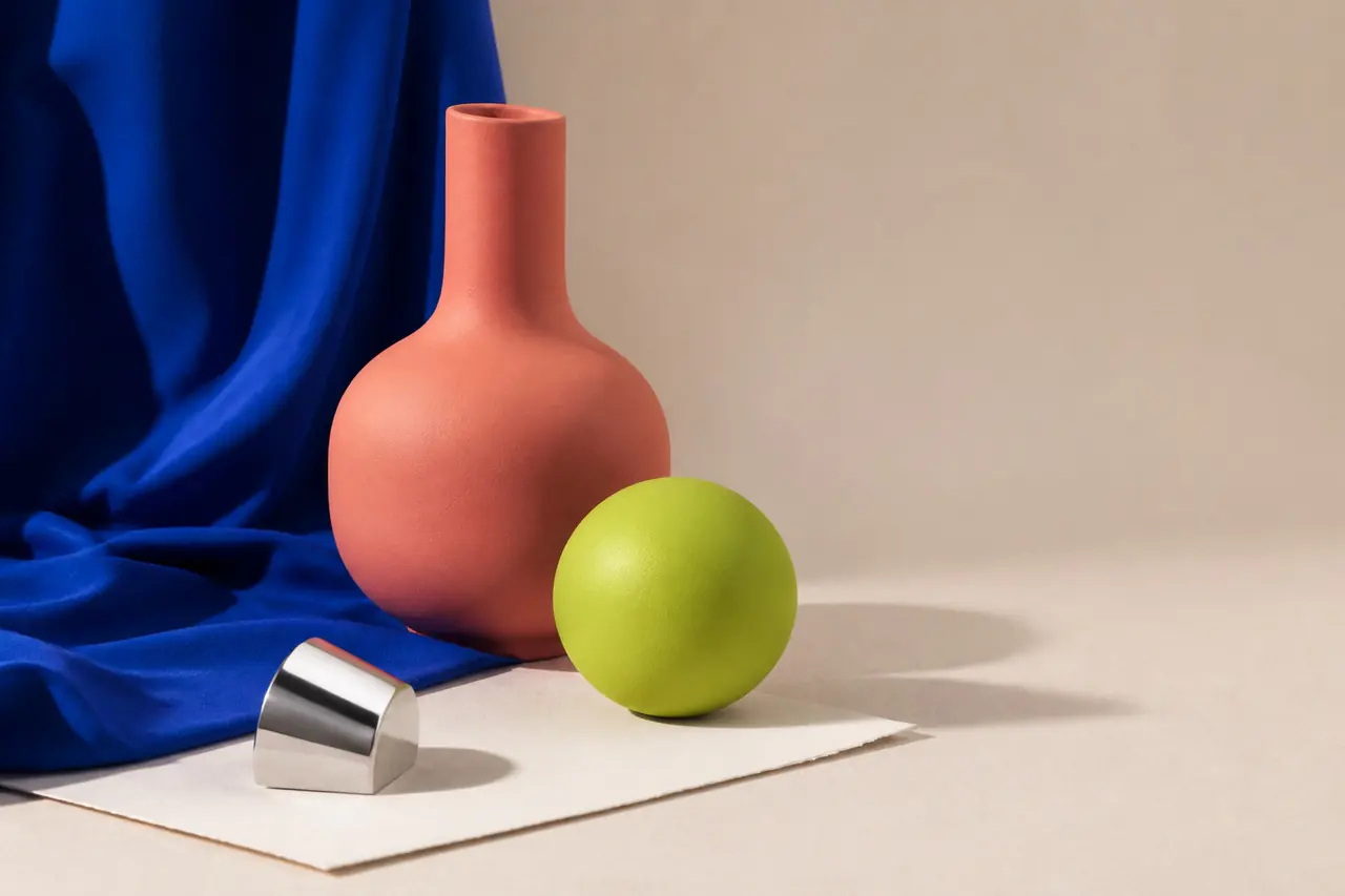
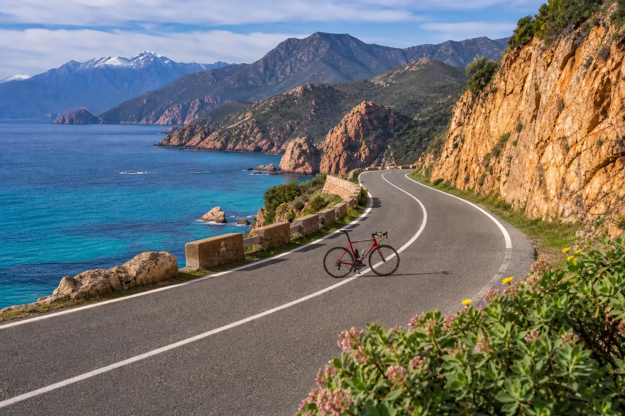
A small set of reusable canvases covers most social placements: square 1:1, portrait 4:5, vertical 9:16, and widescreen 16:9. Platform rules change, so verify the destination before a campaign and keep text inside safe margins.
Recommended workflow
- 01
Choose the placement
Decide whether the asset is a feed post, story, vertical cover, link preview, ad, or video thumbnail. Do not resize one finished file blindly for every placement.
- 02
Start from a layered master
Keep background, image, accent, and text separate. This makes it possible to move the focal point and reflow text for each ratio.
- 03
Protect safe areas
Keep important text and logos away from edges and interface overlays. Preview the artwork at phone size to confirm legibility.
- 04
Export and test
Export JPG, PNG, or WebP, upload a draft when possible, and check the crop on both mobile and desktop before scheduling the final post.
Four practical master canvases
Use 1080×1080 for a flexible square, 1080×1350 for a taller 4:5 feed presence, 1080×1920 for 9:16 stories and vertical covers, and a 16:9 canvas for video thumbnails and wide covers. These are production starting points, not guarantees for every placement.
Official guidance can differ by surface. LinkedIn accepts shared-photo ratios from 3:1 to 4:5 and recommends 1080-pixel width, while YouTube recommends a 16:9 thumbnail and currently lists 3840×2160 as the preferred resolution with a 640-pixel minimum width.
Designing one campaign across ratios
Create a visual system rather than one locked composition. Reuse type scale, palette, logo treatment, and image style, but move individual elements so each format has one clear focal point.
Long headlines that fit a widescreen cover often fail in a portrait post. Shorten copy, preserve hierarchy, and test the final artwork at the physical size of a feed card rather than only on a large monitor.
Common mistakes
- Stretching one finished design into every aspect ratio.
- Placing text against edges where interface controls may cover it.
- Publishing without checking the platform's latest placement rules.
Questions and answers
What is the best all-purpose social image size?
A 1080×1080 square is a dependable reusable starting point, but portrait, story, and thumbnail placements should receive their own crop.
Should I use JPG, PNG, or WebP?
Use JPG for photographs, PNG for crisp graphics or transparency, and WebP where the destination accepts it and smaller delivery files matter.
How often should I verify platform sizes?
Check official requirements before important campaigns and whenever a platform changes its composer, feed crop, ad placement, or thumbnail workflow.